Pages

Showing posts with label punctuation and typography. Show all posts

Sunday, October 27, 2013

Typography-Inspired Superheroes That I Demand Exist

Not that there needs to be typography inspired superheroes, but I’d imagine at the very least that the people who put comic books together would get a kick out of them.


Heroism! Surprise? Yes, make way for... THE INTERROBANG!

And to a lesser extent, maybe also make way for...


That last one… I can’t really explain. I just think pilcrow is a neat word. (Image modified from Captain Marvel art found in a post on this nifty superhero Tumblr.)

EDIT: So the guys at The Bionic Broadcast actually thought through these and came up with what their superpowers might be. Check it out, and if you want to skip to this part, fast-forward to 31:20.

Superheroes, previously:

Monday, October 7, 2013

Fonts and Video Games: A Doubly Nerdy Proposition

If I can pride myself on anything, it’s my thorough command of niche trivia, but I got nothing on this one. Please, can someone with a command of both video games and fonts help me out?

Here is some text that may look familiar:


It’s the logo to this blog. I made it a few years back, and I now can’t remember what font I used. I searched the major font sites and found nothing. I’m pretty sure it came from some eight-bit video game, but I can’t tell which and wouldn’t know how start looking. Do you recognize it? Like, not from this blog? Because it would be helpful if you could tell me.

Thanks in advance if you can.

Tuesday, October 30, 2012

And So Forth (or — On Ampersands)

In the same way I’m intrigued by etymology and the way that we bury the history behind our words, I like to think about punctuation marks. These squiggles convey meaning, but I feel like we rarely stop and think about how they came to signify what they do. Well, Shady Characters considers them, but not everyone reads Shady Characters. (Everyone should, by the way.) I’d actually posted more than once on this subject a long while back, but I’ve decided to revisit it. Today, I’d just like to focus on the ampersand — etymologically and per se and, a mongrel Latin-English phrase more or less meaning “and by itself is and.” It’s pervasive, even when it seems like someone could have found the time to write out and, and even more strangely, it’s readily understood even when it takes on different forms.

Observe:


All of them slightly different, and almost certainly more varied than you’d expect from letters of the alphabet, but all of them being easily read as meaning “and.” Funny how that works. It’s certainly not the form itself that conveys the meaning, because I doubt that many people realize that the ampersand in all its forms is just a stylized rendering of the Latin word et, meaning “and” — as in et cetera. But it is. In each of the six variations I’ve provided, you can see a basic “e” shape conjoined to a “t” shape, in that order. Only in the last one do aesthetics trump readability, but even then you can see how the symbol is basically shorthand — a simpler way of communicating quickly, in the way that cursive speeds up handwriting.

That’s it. That’s the point: Ampersands are just et, written with the goal of celerity. I just feel like not many people notice this. I just feel like once it’s pointed out to you, it’s something you can’t not notice.

Friday, July 6, 2012

The Tyranny of a Single Comma

Could I have been the only one who didn’t realize that the name of the Rolling Stones song was correctly written as “Paint It, Black” — with a comma? And doesn’t that one stray mark radically change how you read the title?

rolling stones paint it black single cover art 1966

Just go ahead and try to arrive at a sensible reason why the title would be punctuated this way. According to a 2003 book on the band, Keith Richards says that the record label, Decca, put the comma there erroneously, so my reaction is “Did they actually listen to the song?” But then I realize that the phrase “paint it black” is never actually spoken in the song. It’s always “painted black” — “I see a red door and I want it painted black” instead of “and I want to paint it black.” In any case, the Rolling Stones’ official website has yanked the offending comma, but isn’t it surprising that it was allowed to linger at all, given that Aftermath debuted in 1966 and even non-Americans would have been aware of the growing civil rights movement?

Sunday, April 22, 2012

A Word for Tearing Things Apart

This little series on strange and wonderful words, which I began nearly four years ago with fissilingual, has covered a great deal of verbal territory — from obsolete gems (darkle) to words that name such specific, obscure things that you’d be surprised to learn that anyone bothered to coin them (jumentous) to jargon known only to specific communities (weeaboo) to awesome non-English words that we’d be better off incorporating (slampadato). But my favorites are always the ones that name familiar things that I’d previously just described in a roundabout way. It just makes my happy to know that they do, in fact, have proper names.

And on that note:
obelus (OHB-uh-lus) — noun: 1. the mark ÷, used to represent the mathematical operation of division. 2. one of several marks used in ancient manuscripts to indicate a spurious passage.
The phenomenal typography blog Shady Characters recently invited readers to name the “approved curl,” a symbol used to mark correct exam answers. (An aside: I don’t think I’d ever seen it before. No, not because I’m dumb. Stop that.) In all the ensuing typography talk, the author mentioned that the technical term for the division sign is obelus. This was news to me. According to The American Heritage Dictionary, the term comes from the Greek obelos, “a spit” or “a sharp stick,” which is the same sort of the word obelisk, which, now that I think about it, is the architectural equivalent of a sharp stick.

What surprised me about the history of the obelus is that it didn’t always refer to the math function. That’s weird because if you really look at this sign, you’ll see that it’s a great visual representation of division: a line that is literally dividing two dots.


But yeah, it once had another purpose: The smartypants of old used the obelus to call out chunks of text that might be somehow wrong, whether as a result of translation errors or info that was just plain bad to begin with. For example, there’s some debate about the Gospel of John’s Pericope Adulterae — the story where Jesus saves an adulteress from stoning by making her would-be punishers remember that they too have sinned. Although the story is one of the more famous of the New Testament, its authorship was questioned by the third-century scholar Origen, who marked the passage with an obelus. And yes, there is a certain irony to him being the one to find fault with the passage that gave the world that famous line, “Let he who is without sin cast the first stone.”

It should be noted, however, that it wasn’t always the ÷ that was written. A simple line could also be an obelus, as could the dagger symbol, or even the sign ./., which is sometimes called a lemniscus and which somehow evolved into the ∞, or the infinity symbol. (This symbol is properly called a lemniscate, and I wrote about it in a previous “word of the week” post.) In fact, there seems to be a great deal of overlap, both in form and name, with the division sign, the infinity sign and the symbols people use to say “Hey, this passage is wonky.” I am not clear why. According to Wikipedia, the obelus was first used to represent division in a 1659 algebra book, and it’s retained that meaning ever since, save for some parts of Europe that use it today to represent a range of numbers or even subtraction, thus explaining my failure at the Norwegian mathlympics.

Previous words of the week after the jump.

Sunday, November 6, 2011

Punctuation for the Awe-Struck Spaniard

Few pet interests could out-geek typography fandom. I mean, you’re talking about enthusiasm for an element of life that the vast majority of people see constantly but which they could not care less about. However, I maintain that punctuation marks are interesting, and the following post will either prove or disprove that assertion.

By now, many literary people know of the interrobang, a sort of punctuational hermaphrodite that mashed the exclamation point and the question mark into a multipronged twofer. Perhaps you read about it on this blog back in 2005, when I learned of it and I exploded with interrobang-worthy levels of surprise and amazement. Or perhaps you’re just, like, super smart. In case this word interrobang is new to you, here’s the gist: Instead of lining the end marks back-to-back in the manner of “It’s full of snakes?!” you can instead conserve space by simply punctuating it “It’s full of snakes‽” (I’m unsure what’s a more shocking thing to be snake-full. Your Prius? A pinata? A womb?) The interrobang is handy enough, I say, though I’d imagine less astute readers would wonder what the hell is wrong with that capital “P.” Invented by ad man Martin K. Specktor in 1962, the interrobang actually found a certain level of mainstream acceptance, even getting a spot on certain typewriter models in 1968. Of course, it never made it to the big leagues, but I say it still has a chance. I mean, look how ubiquitous the at sign and the hash mark are today compared to how rarely we used them twenty years ago.

A funny footnote to the story of the interrobang — a story that, were it published in book form, should be titled Huh‽ Wha‽ Really‽ — is that its creation necessitated a second mark for those writing in Spanish. In this language, writers have the odd habit of giving the reader a heads up with a question or exclamation is coming. I’ve always wondered why, exactly, and why the inverted question mark or exclamation point at the beginning of a sentence stuck with Spanish and no other major language. But this is what Spanish does. Thus, if an interrobang were to be used at the end of a sentence — “Esta llena de serpientes,” for example — you’d need an upside-down one at the beginning.


And the name of this mark, by the way, is my word of the week. (Took me long enough, I know.)
gnaborretni (nab-or-RET-nee) — noun: The symbol ⸘ (an inverted superimposed exclamation point and question mark), used in place of ¡¿ in Spanish, Galician, and Leonese.
The etymology? It’s simply interrobang backwards, which seems especially clever until you realize that the gnaborretni isn’t actually a backwards interrobang so much as an upside-down one. But, you know, whatever.

May all your Spanish interrogative exclamations be stylishly punctuated.


You may be wondering why I have included a picture of an orange wearing a crown. You see, the thing is, my intended word of the week was going to be realgar, the name of a pigment once considered to be the only source of pure orange but which fell out of use because it’s horrendously poisonous. In fact, it’s also one of the main sources or arsenic. This story these once-prevalent colors that we no longer use, in combination with orange’s status as the least-beloved color in the spectrum or even colors that aren’t actually colors, like pink or magenta, seemed promising a few days ago but ended up being pretty sucky when expressed by me. But I’d already Photoshopped the orange. Thus, this: King Orange.

Apparently I think punctuation is more interesting than deadly poison.

Previous words of the week after the jump.
Word nerd? Subscribe to Back of the Cereal Box’s word-related posts by clicking here.

Tuesday, February 23, 2010

Ax Is Not Equal to Battler: What’s the Deal With the Equals Signs in Golden Axe?

A personal challenge for my geekish tendencies: In this post, I will relate an obscure punctuational phenomenon to video games and a luxury hotel. Go!

So back when I was a kid, a staple of pizza party birthdays was Golden Axe, a swords-and-sorcery beat-em-up released by Sega in 1989. (You know which one I’m talking about, people my age. This is the game where you would beat up little gremlins to get magic potions and where you could ride those weird animals with chicken beaks and whiplike tails. Ah, memories.) As with all arcade games, Golden Axe had an “attract mode” that gave the machine something to do when no one was playing. In addition to the typical “Winners Don’t Use Drugs” card, this particular game’s attract mode flashed pictures of the three playable characters and the big bad.

Visual aids, courtesy of Hardcore Gaming 101:


See those weird equals signs between the characters’ first and last names? (Or, rather, what a Japanese person thought should pass for appropriate, Western-sounding first and last names? Though I must admit that I wish my name were Gilius Thunderhead.) What’s the deal? Well, this message thread — a collection of little-known video game facts that I previously linked to sometime back — points out that the symbols are actually double hyphens, a fairly rare punctuation mark used in the following instances:
  • When a nonstylized hyphen simply looks too boring, because you’re fancy like that.
  • On a related note, it’s officially a double hyphen that separates the two parts of the name Waldorf=Astoria.
  • In Merriam-Webster dictionaries, a word that normally would be hyphenated but that is split between two lines gets a double hyphen in order to demonstrate that the word’s internal punctuation should remain at all times, not just when it spans the end of a line.
  • And, finally, in certain contexts, a double hyphen separates first and last names. When writing in katakana characters, an em dash or a regular hyphen normally does this job. However, if this symbol could be mistaken for a prolonged sound mark (ー), the double hyphen does the job. It also sometimes gets to separate multiple foreign names. The example Wikipedia gives for this is the Russel-Einstein Manifesto, which in katakana would look like a bunch of symbols most of you can’t read with what looks like an equals sign in the middle.
So there you go. Though the Japanese usages don’t quite seem to fit the instance seen in Golden Axe, it seems likely that the double hyphens there resulted simply from a designer’s effort to separate first names from last names, Giliuses from Thunderheads. Next time you’re staying at the Waldorf, playing Golden Axe with a bunch of 1990s-era children, or simply struck with the realization that your hyphens look to ordinary, you have options.

A video game-specific follow-up: Those chicken things? With the saddles and the whiptails?


They have a species name, I’ve learned: bizzarians. Or bizarrians, depending on who is typing.

And remember:


… But they do spend all day plunking quarters into a arcade machine slicked over with pizza grease. Thank you, William Sessions.

Thursday, February 5, 2009

The Shape of Music

During my last year at UCSB, I wrote a post on the histories of certain punctuation marks during a time I reserve specifically for this kind of procrastination: finals week. I titled this “The Etymology Round-Up,” though I realize now that the post didn’t concern etymology in the traditional sense so much as why certain symbols have come to represent the things they do — essentially punctuation etymology, if that existed, which it might. This particular post ended up spawning two sequels — neither of which had any more to do with punctuation than the original did — and I’ve ever since been happy to read about those stray squiggles and lines that appear in print but don’t qualify as letters.

I think I’ve stumbled onto some symbols that deserve a bit of attention, even if they’re not punctuation in the traditional sense — they’re musical symbols. Like periods and commas and the like, however, the clefs and accidentals still direct how a “text” should be read and owe more of a debt to the standard alphabet than I would have guessed.

[ Three Sisters, Only One Being Pleasant ]
First the accidentals, which someone once described to me as three sisters — the flat one, the sharp one and the natural beauty. (You know, like every set of three sisters.) For whatever reason, that notion stuck, even if it may have biased be against the poor, flat sister and the unpleasant sharp sister. (Come to think of it, they all have one strike against them on account of each being accidents. Mother and Father must learn to plan better.) For the musically illiterate, the accidental symbols look like this:

left to right: flat, sharp and natural

These dealybobs essentially focus as sheet music white out. They change a note’s pitch from what is described in the most recent key signature of a piece of music. A sharp signifies that a note should be a half-tone higher than it would otherwise, a flat a half-tone lower. A natural cancels out a sharp or flat appearing in the key signature — instead of beside a note as is pictured above — that would otherwise indicate that each instance of a certain note throughout a piece of music should be played either sharp of flat. In short, it makes the note do what it was supposed to do in the first place. (Because I’m a terrible musician, I never progressed far enough to see any double sharps or double flats, which apparently exist, even though they would only appear to tell the performer to hit the note exactly one notch above the one that appears on sheet music. Why such a thing would ever be needed unless someone needed to correct hand-written sheet music, I can’t imagine, since it would otherwise be just as easy to just write in a different note. Are there double naturals? I sure hope so. I want to call them “supernaturals.”) Oddly, all three symbols evolved from the lower-case letter “b” — the sharp and the natural symbols from a “square ‘b’” and the flat from a “round ‘b.’”

When people first began writing out music notation, only the note B could be sharpened or flattened. (I have not determined what the motivation might have been behind this rule, as it seems unfair and mean to the other notes. I would gladly appreciate answers from music scholars or educated guesses from the general public.) As I understand it, music at this point in time was explained on a six-note, or hexatonic, scale, and altering B changed the rest of the notes accordingly. B was natural in the “hard hexachord,” hexachorum durum — G-A-B-C-D-E — and flat in the “soft hexachord,” hexachorum mol — F-G-A-B flat-C-D. It makes sense, then, that the soft hexachord would become associated with the rounded “b” we now use to indicate flat versions of any note. (Wikipedia points out that in French, the flat symbol is called the bémol, from the Medieval French bé mol, or “soft B.”)

How we arrived at the sharp and natural symbols is less clear to me, though both evolved from a square “b.” It had never occurred to me until I wrote this post that the sharp and natural sign are essentially the same with a few lines extended just a bit further in the former. Try it. Draw a natural symbol and lengthen the lines. Play tic-tac-toe on it for all I care.

The hard hexachord contains B natural, while the “natural hexachord,” hexachordum naturale, doesn’t contain B at all. Wikipedia points out that the French call the natural sign bécarre — from bé carre, literally “squared B.”) The French call the sharp sign the dièse — which translates into English as “sharp note” and possibly nothing else or possibly “hash,” depending on how much we want to trust Google translation. The fact that the sharp symbol would currently look almost exactly like the “# symbol” — that is, the hash, the pound sign, the number sign, the octothorpe, the criss-cross or whatever else you want to call this identity-challenged thing — would appear to be a coincidence, given that it comes from the square “b,” but I feel like the passage of time and the prevalence of both symbols probably helped their forms converge so much. Then again, I’ve never heard anything conclusive about how the number sign came to be, so perhaps it the two were actually one in the same way back.
[ Neither Fancy Chins Nor Big, Red Dogs ]
The other symbols I’m talking about today are the treble and bass clefs, which appear prior to the notes in standard sheet music and indicate pitch — or, if you’re a beginning piano student, whether you’ll be playing with your left or right hand. The treble and bass clefs look like this:


Back in elementary school, we had a music class that included singing and basic music theory. The latter, for musically inept children, is more or less limited to drawing the treble clef, which I found exceptionally difficult. For a long time, mine looked like an ampersand and a cursive “S” had an extra chromosome baby that was not long for this world. Even I could draw the bass clef well enough, however.

Again, likely because I never progressed much with music, I never heard these the treble and bass clefs called by their alternate names, the G-clef and the F-clef, respectively. The former takes its name from the fact that the G above Middle C is marked by the line on which its inner curlicue ends, the latter from the fact that the line bracketed its two dots is the F below Middle C. (Okay, in the interest of full disclosure, there’s a third clef, C-clef, whose exact center marks Middle C, but I don’t find it all that interesting so I’ll ignore it for the moment.) The clefs not only demarcate a note, however; they also represent a stylized version of the letter corresponding with that note — the treble being a fancified “G” and the bass being an abstracted, flipped-around “F.”

This website on music history offers a handy illustration of how the “G” and “F” evolved into the symbols we have now.

Thus, in the beginning the symbols were literal — “This is G” and “This is F” — but time — plus, I’d wager, the hurried penmanship of composers and the artistic flair of people in this profession — have made them take on a life and form of their own.

Incidentally, the word clef is the same one that appears in the phrase roman à clef. It’s French for “key.” Just as a roman à clef makes a lot more sense when you know what the author is actually writing about, knowing what notes the dots on the lines are supposed to be makes the song a hell of a lot easier to sing.
Previous etymology of not-words and other punctuation-related stuff:

Wednesday, October 22, 2008

Guacamole Window

In sending an email to my copyeditor last week, I mistyped the code for an em dash (ALT+0151) and ended up producing a symbol that look remarkably like a butt. Not only did I decide against retyping the proper symbol, I actually pointed out the random butt symbol. “Look! I mistyped and made a butt! Isn’t that strange?”

Very professional, I know. In any case, the symbol looked like this:


This eventually caused me to look at the Microsoft Word symbol bank in order to find out what this symbol actually was and, subsequently, to mock the people whose printed language uses butts. Apparently the symbol is ot — a form of the early Cyrillic character omega, a ligature with the character te. It can mean “from,” I’m told. I will continue to imagine that it means “butt.”

In trying to find the Cyrillic butt symbol on my home computer, I ended up noting a few of those other symbols that don’t make much sense to monolingual Americans like myself. I’ve scrolled past them many times and always wondered what they did. Now I know.

First up: The End of Ayah.


I’m calling it The Magical Fishbowl.

Ayah
is the Arabic word for “sign” or “miracle.” (It’s a cognate with the Hebrew word ot, which also means “sign,” though the similarity between that the above ot is probably just a coincidence.) According to Wikipedia, Ayah most often refers to one of the 6,236 verses of the Qur’an, which Muslims each regard as each being a sign from Allah himself. After each one, as near as I understand it, there appears the above symbol with the verse number inside it.

Then there’s this one, which looks a bit like a poorly drawn Star of David but, being Arabic in origin, probably isn’t.


It’s actually the 
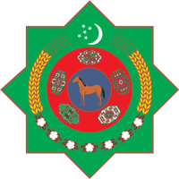
Rub El Hizb — which translates to English as something like “lord of the group” or “sustainer of the party” or “supporter of the sect” or something along those lines. It’s a popular motif for flags and whatnot — you’ve doubtlessly noted it on that Turkmenistan coat of arms that you’ve been seeing everywhere — but also is used to represent the end of a chapter in Arabic calligraphy. Finally, I’m told that the Rub El Hizb represents “an eighth of a juz’,” but I can’t even to begin to figure out what that means.


And finally we have the Place of Sajdah, which I repeatedly read as “Palace of Sajdah,” which sounds a lot more fantastic than the actual name but which doesn’t lend itself to quick and easy Googling. There’s surprisingly little about this one online, at least under the name I have understood to use for it, but it would appear to be the symbol for the notion of prayerful prostration — sajdah, also known as sujud. I don’t understand the connection between the act and the symbol, unless it’s supposed to be an abstracted for of a human, bent down in prayer, wit the diamond-shaped part at the top being that person’s head.

More on punctuation, typogrpahy and other such symbols:

Monday, February 12, 2007

The Punctuation Round-Up, Part Three

In retrospect, this little series should probably be called “The Punctuation Etymology Round-Up,” but there’s something to be said for tradition.

[ Ask a Simple Question ]

I’m completely boggled by the idea of writing in English without the punctuation marks that we’re accustomed to using. The question mark, for example, is one of those squiggles that makes written language understandable. It’s funny how we don’t think twice how a little loopy fragment has come to be so widely understood as the written form of a raise in intonation at the end of a sentence, but the question mark is one of the few bits of punctuation that can convey meaning independently of words. Think about it: A cartoon character who has a question mark suddenly appear over his head is immediately understood to be confused, or at least inquisitive.

A little research shows that it’s not such a foreign concept. By far, the most commonly believed origin for the question mark is the Latin word quaesto, meaning “question.” Various sources cite that the word — sometimes abbreviated “Qo,” sometimes with the “Q” being placed above the “o” — was used as a suffix after interrogative questions. The Q-o stack was eventually stylized — or slurred, if you will — into what we call the question mark.


If you compare the two images, you can kind of see it, especially if you picture the tail of the “Q” being bent down into the bottom leg of the question mark’s top half. Well, that plus the bottom-left quarter of the “Q” vanishing. I like this theory of the question mark simply meaning “question,” since it would seem to make sense, providing the assertion is true. But thought most people think this is probably how this particular punctuation came about, a lot of people also say that no one knows for sure. This is especially odd, since the question mark is fairly new, as far as punctuation marks go.

Various other theories include that the question mark arose from a tilted, tilde-like squiggle coming out from a dot that Eats, Shoots & Leaves author Lynne Truss credits to Alcuin of York. Another recent book, Why Cats Paint, alleges that the mark was originated by Egyptians, who modeled it after a sitting cat, viewed from the back. In this theory, the dot is the cat’s anus. I have to assume that this theory is bunkum since Why Cats Paint is essentially a humor book, but the Wikipedia article on the question marks notes it nonetheless. (I’d guess that this inclusion speaks less to the cat’s anus theory and more to the fact that the Wikipedia is often written by idiots.)
[ An Excited, Erect Point ]
The theories about where the question mark came from may abound, but people seem far more certain about the exclamation point. The only theory I could find online about where we got the stick-with-the-ball-underneath or “yelling mark” posits that it came from the Latin io, meaning “joy.” I’m not sure if it was tacked onto the end of sentences the same way quaesto was, though frankly the idea of people shouting “joy” for no reason after sentences is pretty funny. (“Marcus, there’s an angry gladiator behind you. Joy.”) A slightly different explanation for the symbol has it coming from the “I” in io being placed above a full stop, though I’m not sure the Romans even used full stops.


All I really found of interest about the exclamation mark aside from its origin is the sheer number of alternate names for the symbol, depending on whether it’s being used grammatically, mathematically, in typesetting jargon or in some form of computer science. Wikipedia lists “screamer,” “bang,” “gasper,” “startler” and “dog’s cock,” the last being a fitting, if improbable, complement to the “cat’s anus” explanation for the question mark.
[ The Chandler Mark ]
The exclamation mark has a slight edge over the question mark in terms of versatility. The Wikipedia article notes that British writing sometimes employs an exclamation point inside parentheses to imply sarcasm. I’d represent this with an example enclosed in parentheses here, but it’s next to impossible to properly do that, since it would make it look like I was showing an exclamation point inside two pair of parentheses. I suppose I could set it off by itself, though.


Like that. There, I think that worked.

During a previous Etymology Round-Up, Bri pointed out that the French sometimes use the similar irony mark, or point d’ironie.


It’s just what it sounds like, and as a result I can see why it’s never caught on. Irony, when written well, doesn’t need to be specified as irony. The example the Wikipedia gives is “If love is blind, why is lingerie so popular?” (Just mentally flip the end punctuation in that quote around for the full effect.)

While this punctuation bit has never been formally adopted by typesetters, it looks exactly like a backwards question mark used in Arabic. The blog Ultrasparky notes that it might be really bad form, however, to employ Arabic punctuation to signify the occasion in which someone is expressing the opposite of what they mean, though he admits that such a punctuation could help those on message boards and chat rooms understand when people are speaking facetiously.
[ Short and Simple ]
The proper name for the paragraph mark — that backwards "P" or weird-shaped pi sign, depending on how you look at it — is the pilcrow.

That's all I can give on the subject today. For those that made it this far, feel free to look at the original Etymology Round-Up — in which I talk about the long-lost letter thorn, the ampersand and the interrobang — or the second one — in which I talk at great length about the weird history of the dollar sign.

Friday, August 25, 2006

Have You Ever Seen a Quimp?

"Ten Names of Things You Didn't Know Had Names," at least according to the third volume of The Book of Lists.
  • "columella nasi," or the little flap of skin between the nostrils
  • "dragées," or the hard little candies you use for decorating cakes
  • "fuerrule," or the metal part of the pencil that hold the eraser
  • "keeper," or the band on a belt that holds the end in place after you've buckled it
  • "rowel," the pointed, round thing on the back of a cowboy's spurs
  • "saddle," for the rounded part on a matchbook where you strike the match
And, finally, four different words for the gibberish symbols used in place of swear words. And for God's sake, these were hard dealybobs to find images of.


These symbols, which look like a modified at sign and number sign, are apparently called "jarns."


These, which look like explosive little hatchmarks, apparently are called "nittles."


This sort of pseudo-cursive scrawl is referred to as "grawlix." Good to know. This is what I thought actual handwriting was for my childhood preceding third grade.


And, finally, we have the "quimp." It looks like a crudely drawn man in a sombrero, but I think it's actually supposed to be a planet or something. Like Saturn, with the rings. In any case, I'm fairly certain I've never seen these before in any comic strip I've ever read. But that's what the Book of Lists says, anyway.

Sunday, January 22, 2006

The Punctuation Round-Up, Part Two

Last March, when I should have been preparing for my History 4A exam, I wrote a blog entry detailing the etymologies behind the long-lost letter “thorn,” the omnipresent-but-mysterious ampersand and the obscure interrobang. This is the follow-up to that entry, “Etymology Round-Up.”

[ “S” Goes to Jail ]

Like many people, I have used the dollar sign ($) without ever understanding precisely why an “S” with lines going through it represents the basic unit of American currency. I had heard initially that the sign comes from the expression “pieces of eight,” which is piratespeak for money. In that sense, the dollar sign was literally that — the “S” was actually the remaining chunks of the number 8, after having been divided by vertically cutting lines. But oh, if only it were that simple.

There are quite a few other origin stories that don’t pan out either. One, proffered by the United States Mint, claims that the modern-day dollar sign evolved from a logo that combined the “U” and “S” in the institution’s name, though apparently not the “M.” Ayn Rand apparently endorses this explanation of the sign in Atlas Shrugged. According to the website of researcher Roy Davies, the tenth chapter of Rand's book is titled "The Sign of the Dollar," and in it Rand claims that "the dollar sign was the symbol not only of the currency, but also the nation, a free economy, and a free mind." Though this one would appear to make the most sense, most researchers have seemingly abandoned it as a possible explanation because the dollar sign predates the founding of the United States. (Suck on that, Ayn.) The U.S. Mint website doesn't even list it — or any — explanation in their FAQ section.

Another different history, offered by the U.S. Bureau of Printing and Engraving, claims that the symbol was born as a result of a union of the letters “P” and “S” — as in “peso” or “piastre” or “pieces of silver” or, again, “pieces of eight.” The "S" was apparently written in superscript next to the "P" in "old manuscripts," though these ancient documents aren't cited and God knows where they could be. (This website for the bureau mentions this origin on its FAQ page — scroll down to the bottom third of the page.) This explanation accounts for the fact that the dollar sign was in use to denote other forms of currency long before the United States officially adopted it in 1785, and as a result seems to be the most favored possibility. However, the one vertical bar of the "P" doesn't account for the two vertical bars of the sign itself. (Though I should note that the iMac keyboard I'm typing on now only shows the sign with one vertical bar.)

The Wikipedia site for the dollar sign has a neat little graphic depicting how either the P-S or U-S explanations might have come to be.


Other, less popular theories abound. One purports that the dollar sign derives from an abbreviation for "shilling" — a form a British currency popular around the same time the Britons were drawing slashes through things to indicate that an abbreviation was being used. The still-used symbol for the British pound — £ — also has a slash, albeit a horizontal one.

Another unpopular explanation links the sign to slavery — and the Spanish words esclavo and clavo, meaning "slave" and "nail," respectively. Davies writes that "the shackles worn by slaves could be locked by a nail which was passed through the rings or loops at the ends of the shackle and bent while it was still hot and malleable." In short, the bent loops of the shackle looked like an "S." Once locked, they looked like an "S" with a line through it.

"S" + clavo ("nail") = S-clavo, or esclavo, meaning "slave"

To me, this seems at best another folk etymology, though one that works nicely when you consider what a large part of worldwide economy slaves once composed.

There's even a proposed connection to the Portuguese cifrão, a remarkably similar-looking character that Brazilians use to mark the transition from dollars to cents, much as we use a decimal point. (Well, not dollars and cents, but escudos and centavos. But you get the idea.)

What the Wikipedia entry concludes with, however, is an even stranger origin story for this little guy — and in my opinion, the one that most smacks of the truth. Some theorists link the dollar sign to the Pillars of Hercules, the twinned outcroppings that mark the Strait of Gibraltar — the nautical gateway to the new world. The logo of the two pillars superimposed over images of earth's two hemispheres — Eurasia and this new America thing — appeared on popular Spanish coins after Columbus' expedition and remained there until well after the United States declared its independence from Britain. The two circles representing the then-known world devolved into an "S" and the pillars became twin vertical strikes.

This explanation accounts for the double strike as well as the signs worldwide popularity. After all, the United States isn't the only nation to employ the dollar sign. Argentina, Australia, Brazil, Chile and Cuba also use it. Finally, it makes for sense than the shilling theory, because it seems unlikely that the United States would employ an out-dated currency symbol once held by the then-hated Britain.

Somewhere in these, there's the truth, but I feel like someone with more time than I have will be the one to sort it out.
[ all for you, lauren deny custard ]