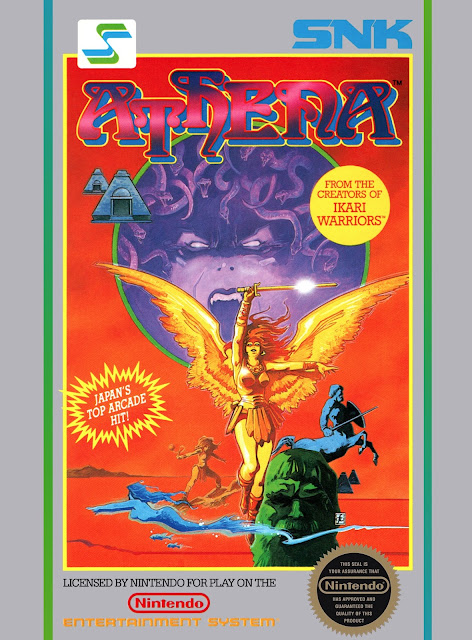
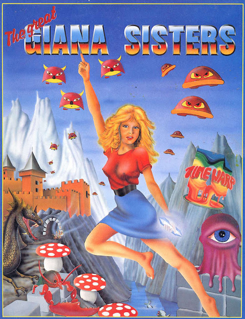
Here’s what we got. Oh holy lord, how the represent a time that came and went. Like Athena here.
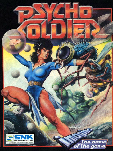
The title character looks full-on godly, which is appropriate, given the game. What you see here is a very American take on the same SNK character that eventually became the King of Fighters regular Athena Asamiya, who is more based on the Psycho Solider version of the character than the goddess-y one seen here. But the Psycho Soldier version gets a shout-out as well for looking rather badass.
She looks very Deanna Troi, but with Chun-Li’s thighs, which is a far cry better than how she looked in the Bob Wakelin art for the original title.
Yeah, the character skews a lot more cheesecake-y over in Japan, though to me the official art for her there reads as more cute than sexy. I’m not sure which is worse. Of note, aside from Athena’s bared skin? The minotaur’s phallic midriff, which Wakelin himself admits is a little weird.
The original Phantasy Star doesn’t disappoint.
The heroine, Alisa, is clearly looking to cause some serious trouble. Please note how her breastplate doesn’t just serve as a boob-enhancing armor Wonderbra, especially in comparison to the Dolph Lundgren-looking lummox on her left. His breasts? Nuts. Maybe they swapped armor. Bonus points for the She-Ra-worthy kitty car familiar. I’m less psyched on the back-of-the-box art...
But I suppose even non-stereotyped female video game characters need sleep. In fancy bedrooms. Overlooking surreal landscapes.
Alisa looks even tougher in the American box art. Certainly more action-ready.
And her hunky friend with the armor boobs looks even more like something from the Folsom Street Fair. So there’s that.
Sega in 1985 released Ninja Princess, whose heroine was changed to a male for the Master System re-release. The original Japanese box art, however, is all about her.
Sure, ninja-hime is a poorly aimed high-kick away from exposing her birth canal, but importantly she’s not doing that quite yet, at least from the angle provided. And while she looks tough, I like that Sega didn’t shy away from the fact that the main character was female, at least in this version. For context’s sake, 1985 was also the year in which Super Mario Bros. was released, and I’d imagine that most people who remember video games back then wouldn’t think of many home console games that starred female characters but weren’t overtly girly in their presentation of them. Here, the main character’s gender seems incidental to everything else about the game.
Similarly, there is Namco’s valkyrie heroine — from a Japan-only NES title, Adventure of the Valkyrie — also sports a hint of leg and a whole lot of plausible armor. I support.
The sequel shows more of the valkyrie but preserves the dignity. I wonder if she’s the Scandanavian Kid Icarus?
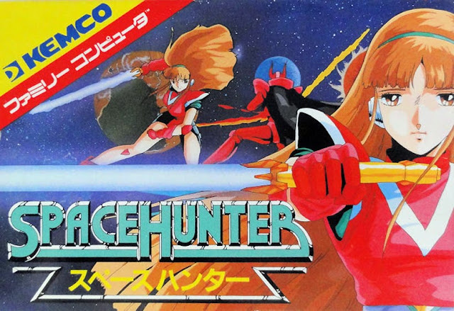
Spacehunter never made it to the states, but I wish it had — in spite of heroine Al Tiana’s pink leotard and because of her weirdly expressionless face. At least she’s not grinning for no reason. After all, there’s much spacehunting to be done.
Not to be confused with Athena from Psycho Soldier, there’s also the Sega title Psychic World, which stars the psychic-enabled Lucia, who looks like all manner of space badass in the art for the Master System release.
The Game Gear release for the title puts Lucia in a more anime style, and that apparently necessitates the birth canal possibility, but she still looks like the superhero the game wants her to be.
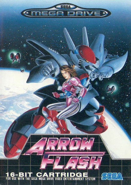
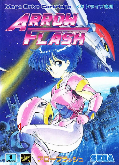
Check out Anna Schwinn on the box art for the Mega Drive title Arrow Flash, looking every bit the Samus Aran-type that Sega would have wanted her to be. What’s especially interesting is how the North American box art compares with the Japanese counterpart...
The big difference here being that the American box art was telling you, “Hey, check out this video game about some space chick and her GIANT FUCKING ROBOT,” while the Japanese box art is just saying, “Ooh, look! A space girl!” In the latter, there’s really not anything more you can take away aside from the fact that the lead character is female, and while the colors and pose are identical for the two depictions of Anna, she looks a hell of a lot tougher in the American version.
And finally, Ghost Lion...
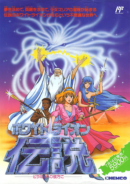
I know I titled this post “Video Game Women You Wouldn’t Fuck With,” and I stand behind that even though in this instance I’d guess you wouldn’t want to fuck with this character because she looks annoying as hell. Just looking at our heroine here, I’d guess this hit shelves around 1985. Nope. Ghost Lion didn’t arrive in the U.S. until 1992, and that makes everything about this all the more baffling. It’s the video game equivalent of a Robin Sparkles video. Yeah, maybe the heroine, Maria, looks like a mallrat version of Sheena, Queen of the Jungle, if she were to be played by Tina Yothers instead of Tanya Roberts and also had been Photoshopped into the promotional materials because she refused to be photographed for weird personal reasons. (It does look like her face was pasted in, right?) But all that awfulness aside, you have to hand it to Kemco for not dressing Maria in pink, not showing off her body, and not giving her a tiara. And even if they had, I still feel like anyone’s take-away looking at the box art now would be “Wow, that is not a current look. Is the game about getting her to a theme party?”
The biggest difference between the American and Japanese versions, I suppose, would be that the Japanese version of Maria looks a lot pinker, though not offensively so. Also, the lion looks a lot cooler here.
This? Appealingly dated. The Lisa Frank nightmare above it? A great example of how being very of-the-moment, aesthetically speaking, can make you horrendously, laughably dated shortly thereafter.
It wasn’t all sensible shoes and armor that actually works, however. In looking through these old titles, I saw a lot of butts, boobs and bows. I think maybe next time I’ll round them up. Also, I’m sure I missed some great examples of women in early video game box art. Did I? Tell me. I can include them in future posts.
Gender and video games, previously:

