
Showing posts with label die wunderkammer. Show all posts
Showing posts with label die wunderkammer. Show all posts
Monday, February 15, 2016
Wednesday, January 20, 2016
“Whitney Houston Goes to Africa to Fight Demons”
I know this is just the dumbest thing in the world, but sometimes you make a few stray clicks too far and end up on a whackadoo Illuminati conspiracy website, and it’s kind of like the web version of one of those poorly Xeroxed flyers homeless people try to give you. While you’re floating in all this word soup, you realize that a lot of the Hollywood conspiracies that the author is putting forth sound like pitches for movies you’d want to see.
An edited list:
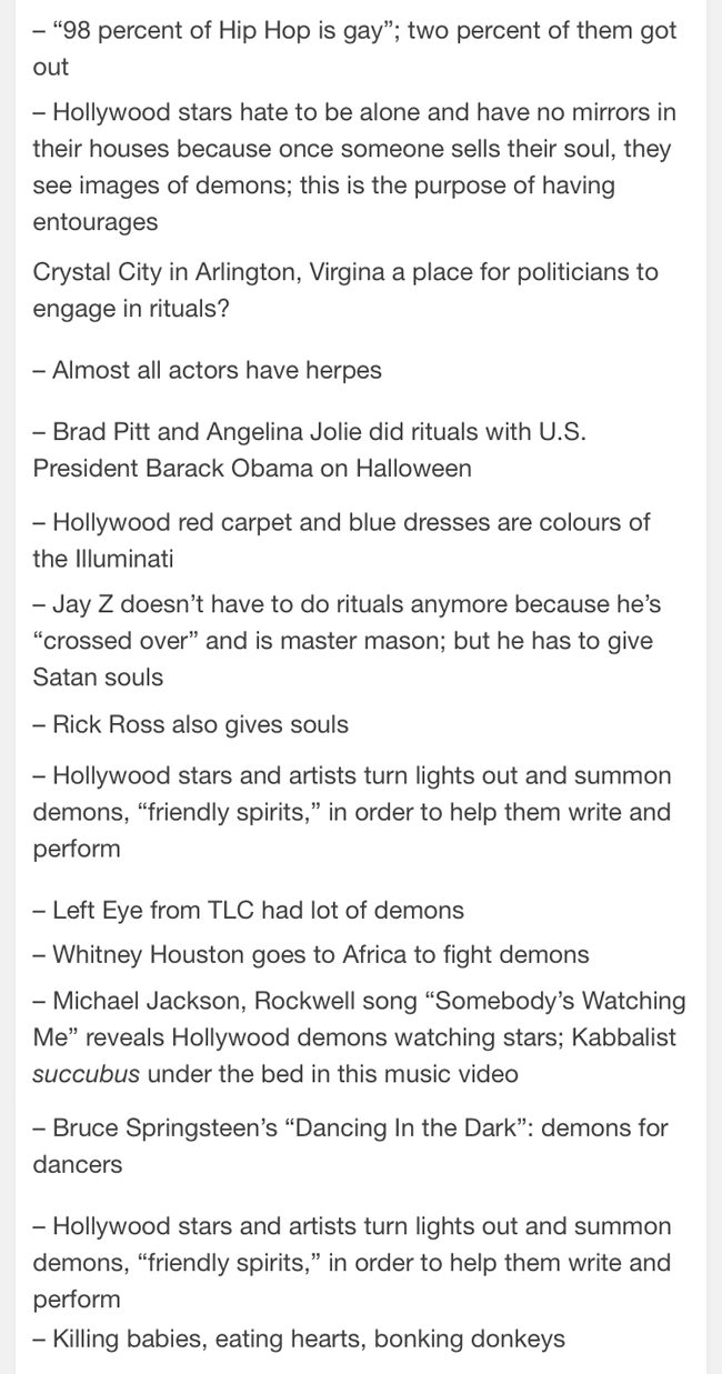
And if someone hasn’t used the text Killing Babies, Eating Hearts, Bonking Donkeys as an album title at least, that’s a shame, because there’s some sick internal poetry to it.
An edited list:
And if someone hasn’t used the text Killing Babies, Eating Hearts, Bonking Donkeys as an album title at least, that’s a shame, because there’s some sick internal poetry to it.
Saturday, July 4, 2015
In Which Jada Pinkett Gets an Obscene Phone Call
Sometimes your celebration of America begins with poking around online and finding a German-language poster for Scream 2. For a piece of promotional art that came out in the late ’90s, this poster pings all your old movie nostalgia censors. It reminds you of something that would have come out two decades earlier.


The American poster for Scream 2 features Pinkett too, but in the same ghostly white as Neve Campbell. (And yeah, in the first version of this post, I assumed that it was Courteney Cox appearing on the left side of the poster before a commenter pointed out that Cox does not have brown eyes. On second look, that is totally Jada Pinkett. I guess the white skin threw me.)

It’s interesting that this German poster, and only this German poster, puts Pinkett front and center in the way Barrymore appeared on the first poster and doesn’t change her skin tone.

You don’t even mind that during the scant few minutes that Jada Pinkett actually appears in Scream 2, she never uses a phone, to say nothing from using an old-fashioned pay phone receiver. And you wonder what aesthetic debate went into the decision to feature Pinkett’s skin as being brown. Of course, her skin actually is brown, and that’s actually an important aspect to the role she plays in Scream 2, what with the discussion with Omar Epps about African-American representation in the horror genre and the general tendency to kill off the black guy first.
In the poster for the first movie, Drew Barrymore’s face shows up ghostly white.

The American poster for Scream 2 features Pinkett too, but in the same ghostly white as Neve Campbell. (And yeah, in the first version of this post, I assumed that it was Courteney Cox appearing on the left side of the poster before a commenter pointed out that Cox does not have brown eyes. On second look, that is totally Jada Pinkett. I guess the white skin threw me.)

It’s interesting that this German poster, and only this German poster, puts Pinkett front and center in the way Barrymore appeared on the first poster and doesn’t change her skin tone.
Saturday, June 6, 2015
My First Creative Effort of My Thirty-Third Year
I have had a birthday. I have entered my Jesus year. I have been at a loss for time to write about this passage. But today I am posting the first remotely creative thing I have done in this new year of life.
I apologize in advance for it.

That’s it: just a close-enough match of the original book cover font and a few new words to illustrate what was just simmering below the surface on the original cover.
The cover illustration was done by an artist named Nick Backes, whose work I’ve just recently encountered. He is very, very good at drawing the male form, and his dudes embody a certain 80s sensibility that is very clearly of an era that hasn’t dated well yet still worth a look, if well-coifed, Zach Morris-y types do it for you.

Some of it verges on camp…

Yet there’s still something there. To more successful creative endeavors in the next 364 days.
I apologize in advance for it.

The cover illustration was done by an artist named Nick Backes, whose work I’ve just recently encountered. He is very, very good at drawing the male form, and his dudes embody a certain 80s sensibility that is very clearly of an era that hasn’t dated well yet still worth a look, if well-coifed, Zach Morris-y types do it for you.

Some of it verges on camp…

Yet there’s still something there. To more successful creative endeavors in the next 364 days.
Thursday, October 30, 2014
This Tree Bears Deadly Fruit
Can we talk about the loaded symbolism of this comic book cover for a moment?

On second thought... let’s not.
DC’s Unexpected, May 1972. Cover art by Nick Cardy. Originally posted by Rainy Day Recess.
Also, while on the subject, Unexpected, December 1867. Cover art by Jack Sparling.
Also, while on the subject, Unexpected, December 1867. Cover art by Jack Sparling.

Wednesday, May 14, 2014
Clouds and Clouds and Clouds
This and only this today: background clouds from the dystopic Neo Geo shooter Metal Slug 3 — first in their original form and in every subsequent instance a variation and another variation because I could not decide which looked best. Clouds. Clouds and clouds. Different, fake-looking, stage background clouds.


“But you could be taking photos of real clouds,” you say. Ha. But ha. I live in Los Angeles. There are no real clouds here. Just wildfire smoke.
(Original background pixels via Spriter's Resource.)
“But you could be taking photos of real clouds,” you say. Ha. But ha. I live in Los Angeles. There are no real clouds here. Just wildfire smoke.
(Original background pixels via Spriter's Resource.)
Friday, April 18, 2014
Abstract Sunset
I made this today, for reasons I am not clear about. I actually don’t feel like going into it, but I have to say that this might be more meaningful if interpreted on its own, free of its original context, which I’m not telling you about anyway.

In my head, this sounds something like this. This concludes an unusually busy week.
In my head, this sounds something like this. This concludes an unusually busy week.
Friday, January 31, 2014
More Like Lamb of Gaudiness, Am I Right?
I’m fairly certain that it wasn’t the intention of the God-minded artist who painted this, but my take-away from this is “Jesus who? This lamb looks awesome and it’s not even doing anything. It’s just standing there, being like ‘What? What? Come at me, faithful.’”
Obviously, I’m supposed to worship the lamb.
Like, I think I should go door to door collecting donations so that we can make a giant gold statue of this lamb in hopes that it will use its mystical powers in our favor. That’s what God would want, otherwise he wouldn’t have made this lamb seem so cool. Because look at it! Clearly, everyone in the painting has come under the thrall of this lamb god, and they seem pretty stoked on it. Why aren’t we worshipping this kickass lamb already, people?
Obviously, I’m supposed to worship the lamb.
.jpg) |
| (via) |
Sunday, January 26, 2014
You Are What You Ride
The innuendo possibilities here are endless, but they begin and end with this fellow’s finely trimmed mustache.

And that’s before you even consider the how Photoshop can come into play here.
Image via.
And that’s before you even consider the how Photoshop can come into play here.
Image via.
Saturday, November 16, 2013
Wallpaper for the Adventurous
No, I’m not going to make a habit of posting vintage wallpaper on this blog. I’m sure there’s already a blog for that. But I will post this: wallpaper I stumbled onto last summer. It dates back at least to the ’60s, and it represents everything that I think being a boy meant back then.

Do as you will with it.

Do as you will with it.
Monday, November 11, 2013
“It Gives Me the Scary Creeps” — The Bold Experiment in Confusion That Is The Visitor
Last week, I watched a Cinefamily screening of The Visitor, a 1979 film-like thing that stars John Huston, Shelley Winters, Glen Ford, Sam Peckinpah and the original Django for no reason that I can tell. It’s a good cast, yes, but the film itself is the kind of mess that results when the director gets fired and then the producer is threatened at gunpoint to not only hire the director back but also give him carte blanche to complete the film in whatever fashion his whackadoodle brain chooses. (That’s the story related to the audience at the beginning of the screening, allegedly shared by the original screenwriter.) At the time The Visitor hit American cinemas, critics accused it of ripping off both The Omen and Close Encounters of the Third Kind, but I can’t imagine director Michael J. Paradise saw either of these films nor any other film ever, because this thing defies description — and not in a good way.
Check out the Drafthouse Films trailer:
And here’s a fan-made trailer:
Both prepare you for the kind of surreal, flashy Italian horror movie that I usually go nuts for, but what the trailers don’t tell you is that The Visitor is kind of a piece of shit. After the first half-hour, the visuals can no longer make up for a plot that herka-jerks from a confusing beginning to confusing ending. You wonder what’s going on, then you stop wondering, and then you’re just sitting there, watching characters act without explanation or any clear motive. I stopped caring how weird it got — and yeah, I’m surprised that I just typed that too — because the film’s weirdness never outmatched its suckiness.
It boasts some decent visuals, I’ll admit, and I like the art used to promote its various international releases, even if it promises some sort of galactical, city-destroying eyeball monster that doesn’t appear in the film in any way whatsoever. So here is my public service to the world: I’m going to post all the grabby stills and posters I can find. These plus the two trailers posted above equals an overall more pleasant (and less lengthy) experience than you’d have if you actually sat down and watched The Visitor.
This last one I actually love. I want to watch the movie that this art represents. I’d also hang this on my wall if I could. I only wish I could find a bigger, higher-resolution version.
Oh, and here’s a random scene I found during my online rummaging. It’s about as representative of the tone of the film as anything else.
You’re welcome.
Check out the Drafthouse Films trailer:
And here’s a fan-made trailer:
Both prepare you for the kind of surreal, flashy Italian horror movie that I usually go nuts for, but what the trailers don’t tell you is that The Visitor is kind of a piece of shit. After the first half-hour, the visuals can no longer make up for a plot that herka-jerks from a confusing beginning to confusing ending. You wonder what’s going on, then you stop wondering, and then you’re just sitting there, watching characters act without explanation or any clear motive. I stopped caring how weird it got — and yeah, I’m surprised that I just typed that too — because the film’s weirdness never outmatched its suckiness.
It boasts some decent visuals, I’ll admit, and I like the art used to promote its various international releases, even if it promises some sort of galactical, city-destroying eyeball monster that doesn’t appear in the film in any way whatsoever. So here is my public service to the world: I’m going to post all the grabby stills and posters I can find. These plus the two trailers posted above equals an overall more pleasant (and less lengthy) experience than you’d have if you actually sat down and watched The Visitor.
 |
| via |
 |
| via |
 |
| via |
 |
| via |
 |
| via |
 |
| via |
 |
| via |
 |
| via |
 |
| via |
 |
| via |
 |
| via |

 |
| via |
 |
| via |
 |
| via |
Oh, and here’s a random scene I found during my online rummaging. It’s about as representative of the tone of the film as anything else.
You’re welcome.
Saturday, November 9, 2013
Considerably North of the Tiki Room
This is the wallpaper in the former Fred Harvey Restaurant at L.A.’s Union Station. There’s nothing in particular I can say to convince you why it’s nice to look at, but maybe if you just look at it, you’ll see the appeal yourself. Click for the larger version if you must.

Because parrots.

Because parrots.
Monday, November 4, 2013
Steven Universe Is Beautiful, and Here Are 40 Reasons Why
I watched the first episode of the new Cartoon Network series Steven Universe, which premieres tonight at 8, and I’m happy to report that I loved it. Steven Universe could become a big deal for Cartoon Network. I hope it does, at least. It looks beautiful. It reminded me of Ponyo in the way it smooshes goofy and serious together onto a colorful landscape, and the character design suggests a world that Osamu Tezuka might have dreamed up — lanky Pearl in particular.
In case you need convincing about how great Steven Universe looks, here are 40 stills from the pilot that show off the majesty and hint at what it may be capable of.


In case you need convincing about how great Steven Universe looks, here are 40 stills from the pilot that show off the majesty and hint at what it may be capable of.


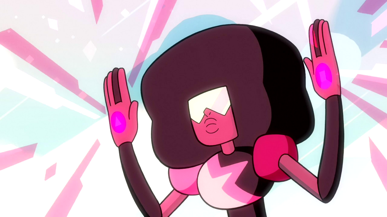


Also? Happy to report that I approve of Estelle as a voice actress. Singers do not always make for good voice actors, but Estelle does as Garnet. Also also?I have investigated and discovered that “American Boy” holds up pretty well. Your day will perhaps be better if you give the original take on it a spin right now.
Subscribe to:
Posts (Atom)